Your website menu (aka navigation menu or navigation bar) is critical to the user experience. If your website’s menu doesn’t…
Your website menu (aka navigation menu or navigation bar) is critical to the user experience. If your website’s menu doesn’t have a clean design, users will struggle to use your website and leave. While it can seem like a good idea to have as many options as possible available for your visitors when they’re on your website, it can actually push them away. The navigation menu on your website is one of those places that can make the difference between a visitor turning into a customer or not.
Typically, desktop websites use a horizontal menu and mobile websites use what is called a hamburger menu. Sticking with these design norms helps new visitors intuitively understand how to use your website. It’s important that there is a minimal learning curve when visiting your website. You will also want to make sure there’s ample negative space in the header of your website to let what’s truly important to your potential customers shine through.
Here are some steps you can take to simplify your menu so that making the right decision is a breeze for your customers.
Let’s take a look:

The number one rule for simplifying your menu is keeping the number of options to a minimum. The options in your website menu should link to the most important pages on your website. Most studies and experts agree that the ideal number for primary website menu labels is 7 or less.
There are two main approaches to naming website menu labels.
Object-based labeling uses nouns to create categories for the content of a website. When using object-based labeling, we encourage you to be creative when possible. If you can avoid using generic labels, do it! Using descriptive labels provides context to search engines and new visitors about the content of your website. That being said, don’t be long-winded with your labels. Keep the number of words and characters to a minimum.
If you have a simple information architecture with 5 labels, you could dedicate three of these menu items to non-generic labels. For example, a composting company could use 3 labels to highlight their product offerings (compost, compost tea, compost bins) then link to their blog and about page.
Examples of object-based labels are Services/Products, About, Blog, Contact.
Action-based labeling uses verbs to help guide web visitors. Action-based labels are most effectively used by brands with high customer awareness where web visitors are coming to the website ready to take action.
Examples of action-based labels are Apply, Donate, Partner with Us.
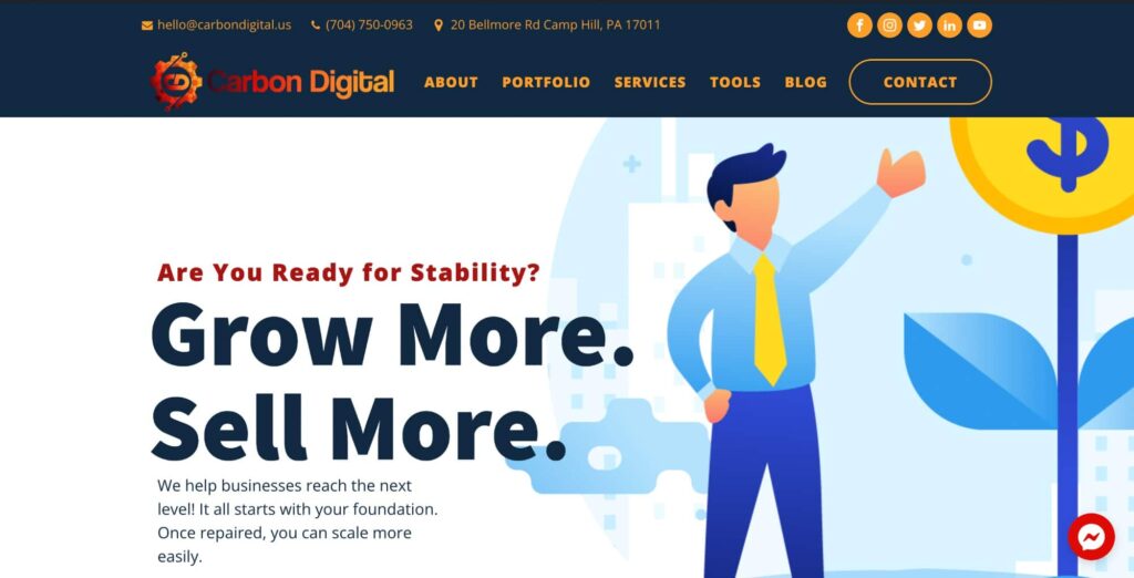
As you can see above, Carbon Digital uses the object-based approach, and its most important pages are the About, Portfolio, Services, Tools, and Blog pages.

Secondary links should be in the drop-down menu and/or in the footer of your website. Not all websites need a drop-down menu. It depends on the information architecture of your website. If your website is content-rich, it will be hard to avoid a drop-down menu. That being said, you might not need a drop-down menu for every label in your menu. For example, a designer might need to add several secondary links for product labels and not have to add any for the About label.
One disadvantage of using a drop-down menu is that it can draw the visitor’s attention away from the main page linked in your primary navigation menu. If you decide to use a drop-down menu, we recommend closely monitoring the traffic for the main menu page and the secondary links.
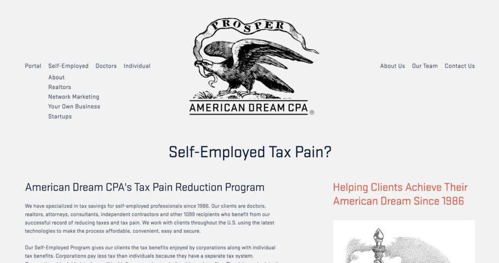
At Carbon Digital we try our best to avoid drop-down menus, but, as we discussed, it’s often necessary. In the screenshot above of a website we designed for American Dream CPA, you can see the drop-down menu under self-employed.
Mega menus are those large menus that have lots of categories and numerous subcategories beneath each one. You’ve likely come across a mega menu at least once. Very few website’s need to use mega menus. For example, mega e-commerce retailers need mega-menus to categorize their product inventories. They are great for showing every option, but the clutter can put a visitor off or confuse them into indecision.

One common mistake that many websites make is not optimizing their menus for different devices. Mobile website design should arguably be your business’ top priority. Google uses mobile first indexing, and the majority of their organic search traffic is from mobile devices. Computers, tablets, and phones need to display your menu in a consistent manner, so make sure it’s designed to fit every device.
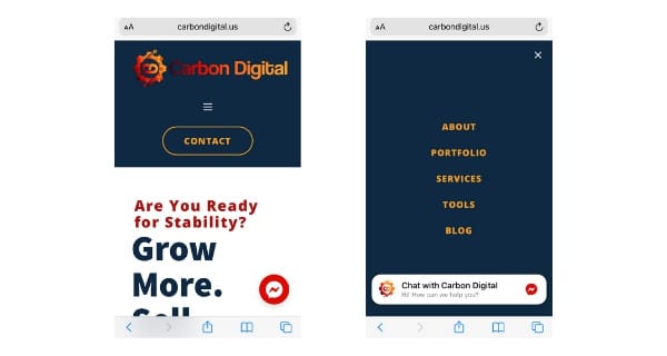
On mobile, it is even more important to have a minimalist menu that’s clutter-free. Most mobile websites use a hamburger style menu. A hamburger menu is a minimized navigation menu that is symbolized by three horizontal lines. When a hamburger menu is clicked it expands to display the different menu labels. You can see the hamburger (three lines) and how it opens up to display the different options in the screenshot above.
Use an easy-to-read brand font for your website menu. You don’t want your website visitors to have to break out their reading glasses to use your website. You want a clean design with sufficient contrast between text and background. Try your best to avoid “fancy” fonts on your menu and stick with your brand fonts.
Resist the urge to shove every possible element into your website header and navigation bar. Consider using the elements that you were on the fence about adding to your navigation bar and header to an additional menu in your footer. A footer menu is a great place to highlight your social media icons, your contact information, useful links, trust seals, and policies.

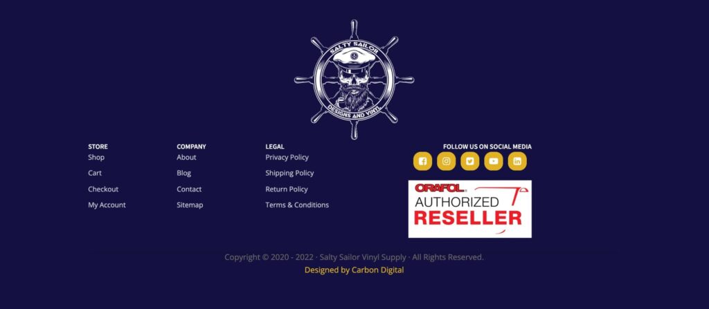
In the above screenshot, you can see the footer menu our team created for Salty Sailor. For this e-commerce client, it was important for the client to display their trust seal and various policies; however, we felt it wasn’t worthy of prime real estate in the navigation menu. Creating a footer menu was the perfect solution!
Experimenting with your website menu can create significant user experience improvements, and ultimately revenue increases. We encourage business owners to think creatively about their menu but not to stray too far from the norms of website menu design.
Stray from the norm with your labels! Labels have norms, but matching everyone else’s web menu doesn’t help your business differentiate itself. Experiment with action-based vs object-based labels or try using specific keyword labels vs generic labels.
On the other hand, your navigation menu isn’t the place to think differently. You want your navigation menu to seem familiar. Use familiar locations for elements like social media icons, search bars, calls to action, etc. Using these conventions of web design and familiar locations will help potential clients navigate your website with ease and allow them to focus on what you have to offer.
For more examples of Carbon Digital’s design work, you can view our portfolio and visit client websites.
Copyright © 2017-2025 · Carbon Digital · All Rights Reserved.